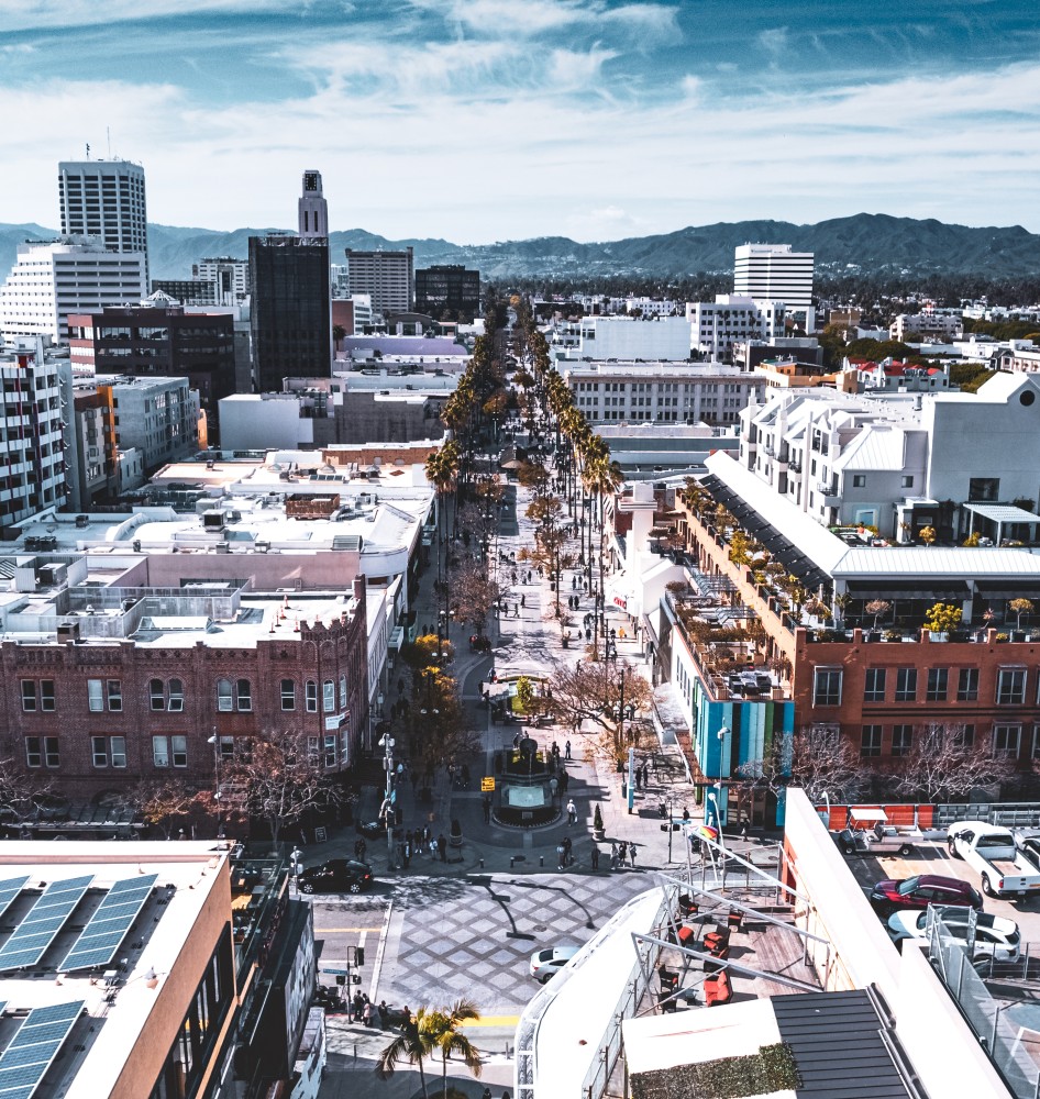
[SMa.r.t. note: Eight years ago, our highly esteemed and recently-passed colleague Ron Goldman documented his thoughts on the need for urban and architectural design in Santa Monica. We are revisiting his essay below (with minor edits) as they still hold vital relevance today.]
Urban planning and architectural design are both subjects that have not been addressed adequately in practice and our current codes. Urban and architectural design is an important aspect of both our visual and emotional environment. Cities help us to be more connected and involved, but we’ve yet to decide what the vision for our City is. Are we a metropolis or a beach city? Peggy Clifford asks: “Is Santa Monica having an identity crisis — is it a great place to visit or a great place to live? Is its primary reason for being love or money?”
We have a heritage to protect, a wonderful combination of a natural beachfront environment and the human scale development like our courtyard housing. This spacious, sunny quality of life is one of many factors that make our City iconic.
But over-development is consuming our city and its resources. Speculation is taking precedence over all other residents’ concerns. Santa Monica has become a developer’s goldmine due to the council’s myopic focus on affordable housing at the expense of other considerations. At times, it appears that they will approve virtually anything for a few units of affordable housing, leaving residents with the impression that our city is for sale.
This growth is a sure path to future nightmares. Increases in density, height, and infrastructure — from water to schools — isn’t solving problems, but rather creating more of them. The LUCE was created to protect our unique beach town; unbridled growth will accelerate its demise.
It wasn’t long ago that developers lived in the same communities where they built their projects. They came to understand that good design was good economics. Today’s corporate economy does not care about wellness, quality of life, or open space and blue sky. Their interests have narrowed to maximizing rental area and their profits.
As this tug-o-war between residents and corporations unfolds, how do we find common ground where all parties can prosper? This will only happen when we have a carefully conceived and amended code that sets area limits and criteria for design and open space.
Urban design is not about iconic buildings but about buildings that work well both individually and together. The LUCE calls for “placemaking,” using design standards and guidelines to shape projects that connect people by providing gathering spaces with landscaped connections. Urban design is about respecting historic streets and landmarks – areas that give a community a sense of place. Successful buildings and streets are those that have good design coupled with human scale and greenery. The ethos of a city is embodied in its architecture and open space.
Great design doesn’t require excessive height. Is Godzilla more beautiful than the rest of the tribe? It is the collective beauty of a City that makes it iconic. We can’t impose our will on nature but must learn to live with nature with a commitment to the preservation of our natural environment — our beach, palisades, weather, blue skies, and sunlight. This same attention must be applied to our infrastructure — our schools, libraries, and cultural venues. The city should be primarily for residents, both present and future. While tourism and business development are important, they should never be the driving forces of any City’s design or raison d’etre.
Open space on every street brings a City to life. But our streets are becoming dark corridors of uninspired architecture and gridlocked traffic. Streets are being filled with tall buildings and tiny apartments looking into small interior courtyards. Quoting our colleague Thane Roberts, “When you pack 100 oranges into a 50 orange crate — everyone gets bruised.”
The good news is we can still have significant room for growth on our boulevards without turning “Silicon Beach” into Miami Beach. There is an extensive supply of one and two story buildings and undeveloped lots on our boulevards and in our downtown. These can be retrofitted or redeveloped for workforce housing and ground floor retail to greatly activate our streets. In the future, this is one of many areas where future housing for young workers, professionals, and families who can’t afford detached housing might be built.
If one were to drive Jefferson Boulevard east of Lincoln, you would see mile after mile of massive apartment blocks. Today, the same can be seen on a short drive down 5th Street in our downtown. In a couple of years, you will see the same thing in the proposed Millennium East Village — a massive prison of 356 apartments that’s replacing 99 low-income seniors once living under a beautiful grove of trees.
Savannah, Charleston, and Asheville are communities that experienced substantial growth in the past two decades but held onto their iconic history and sense of place. Their downtowns are similar in area to Santa Monica and are flourishing with creative, open space, pedestrian activity, and adaptive re-use. But you needn’t travel that far to find successful urban design. If you were to take the freeway to Pasadena, you would discover passageways and arcades filled with people and small shops. Rather than “iconic hi-rises,” you will see restaurants opening to street-side patios, 5- to10-foot passageways with café seating or florist shops, or 20-feet-wide skylit shopping arcades in projects that covers multiple lots. If blades of grass or roots of trees can grow in the narrow spaces between boulders, then landscape can flourish alongside our streets, buildings, and cars.
Architectural design is a dialogue between the building, its environment, and its user. It is, at its simplest, a series of spaces — horizontal or vertical, static or dynamic, rectangular or curved. Surprisingly, the beauty of architecture often lies in the voids rather than the solid forms that enclose them. A significant part of the design process is the way a building interacts in a progression or layering of these spaces and solids. It is not about overwhelming you but rather conceiving a building and its environment as one, about indoor and outdoor spaces being connected, sometimes seamlessly and at other times ways that surprise or delight.
Architectural design should be much more than the prevailing building mass with its abundance of jutting balconies — a “facadomy” translated to the language of a computer punchcard. The design of apartment buildings today as fortresses with their hidden interior space is alienating and demoralizing. Why does the city approve massive, banal buildings? L.A. Times columnist Steve Lopez suggests that when this happens, “both developer and architect should be arrested for indecency.” We may have evolved in nature, but our contemporary habitat has largely become an indoor environment. We spend day and night in dark corridors, windowless offices, at a desk facing a computer in artificial light. Where is the greenery and open space from which we evolved?
There is ample opportunity within the zoning envelope to get away from this robotic design to create environments that are win-win for developers and residents. But to date, the zoning code has resulted in ill-designed buildings that, with their height and density, have lead to the “canyonization” of our cities.
Our history of courtyard housing could be applied to our downtown buildings with sideyard setbacks above 1st or 2nd floors, providing added light and air. The inclusion of mid-block passageways would give buildings added identity as opposed to their current massing that is often cheek and jowl.
Where are apartments with corner windows allowing you to feel part of the environment rather than looking through a window at the environment? Why are there long, dark corridors without windows? Why aren’t there courtyards for recreation and relaxation, where you can talk to neighbors, sun yourself, or just enjoy a quiet afternoon.
We need to bring the outside in with building area reduced by 30 percent on the upper levels of 3- and 4-story buildings — providing terraces for community gardens. At street level, alleyways should be made more pedestrian friendly; rear elevations should create more visual interest. Finally, all new buildings need to comply with the new California guidelines to avoid the casting of shadows on their neighbor’s gardens and/or preventing their rooftop solar collection.
Thanks for listening.
Ron Goldman for SMa.r.t. (Santa Monica Architects for a Responsible Tomorrow)
Santa Monica Architects for a Responsible Tomorrow: Mario Fonda-Bonardi AIA, Jack Hillbrand AIA, Architect, Daniel Jansenson, Architect, Building and Fire-Life Safety Commission, Michael Jolly, AIR-CRE, Thane Roberts, Architect, Marie Standing, Robert H. Taylor AIA, Architect, Samuel Tolkin Architect & Planning Commissioner.


